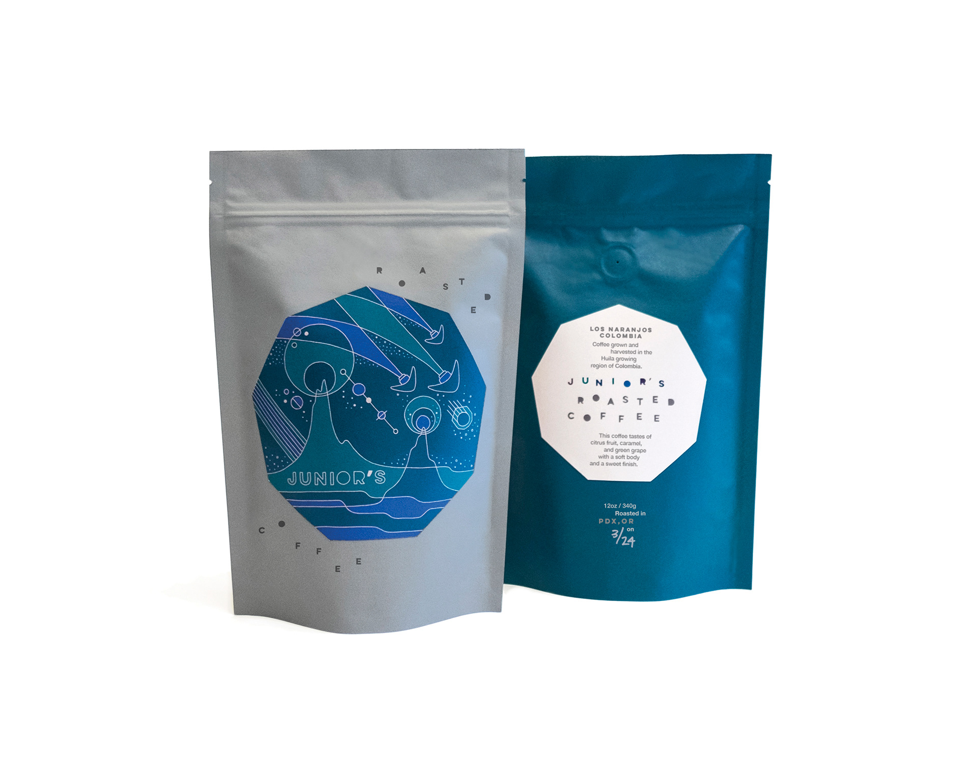
I was originally hired to build the Brand & Identity for Junior’s Roasted Coffee, and the packaging design was our second project.
The brand itself is a concept based around the idea that “Junior” is the ‘offspring’ of Founders, Caryn & Mike Nelson — that is how they came up with the company name. I took this a step further and visualized Junior as an inquisitive child with combined traits from both Caryn & Mike. Junior has a limitless imagination (and hope for all the possibilities of the future) with a bent toward geekery and scientific thinking. The logo mark was designed to be modular — a nod toward Scandinavian design & roasting style that Junior’s has taken inspiration from — as well as a hint toward the endless and whimsical imagination a child has.
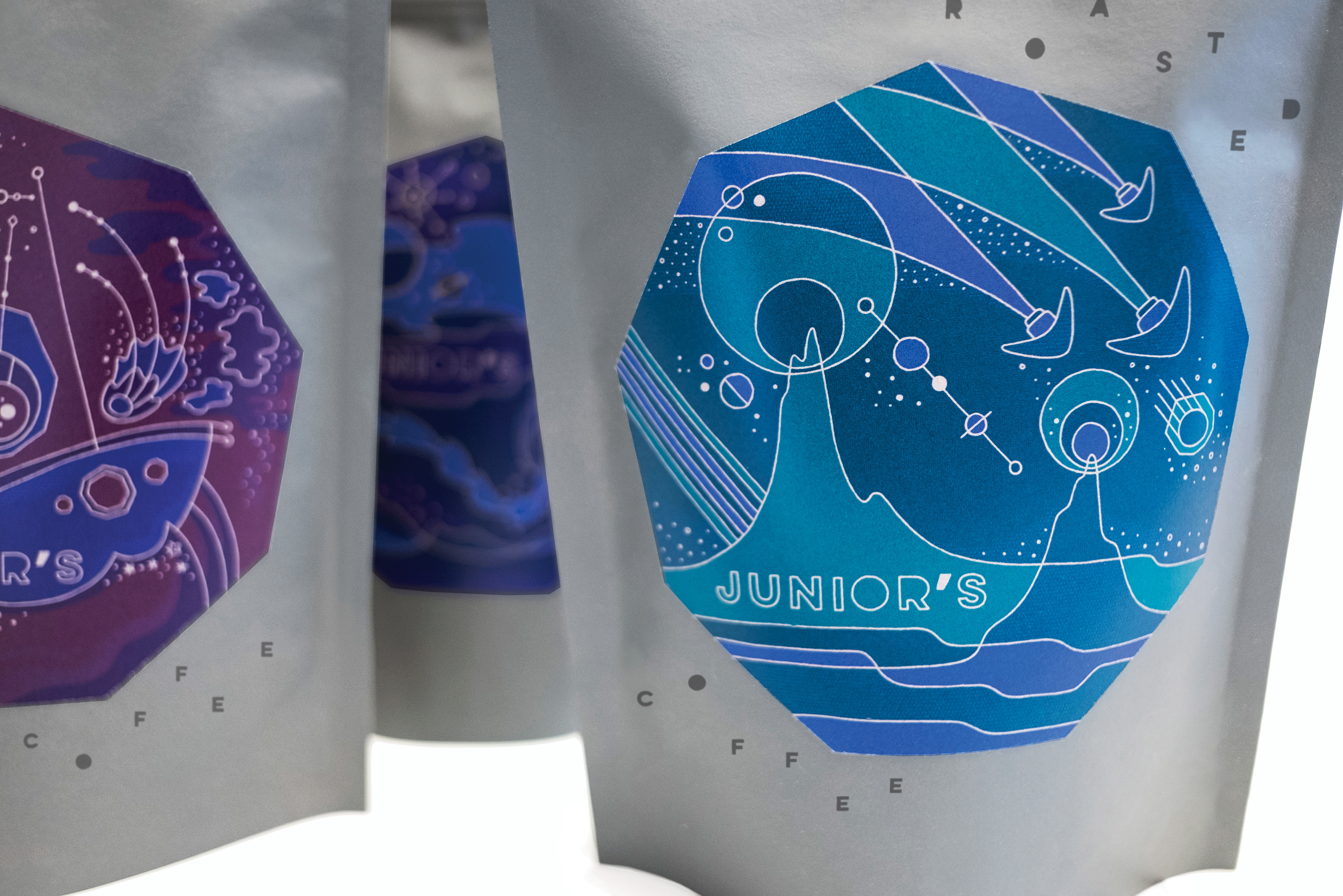
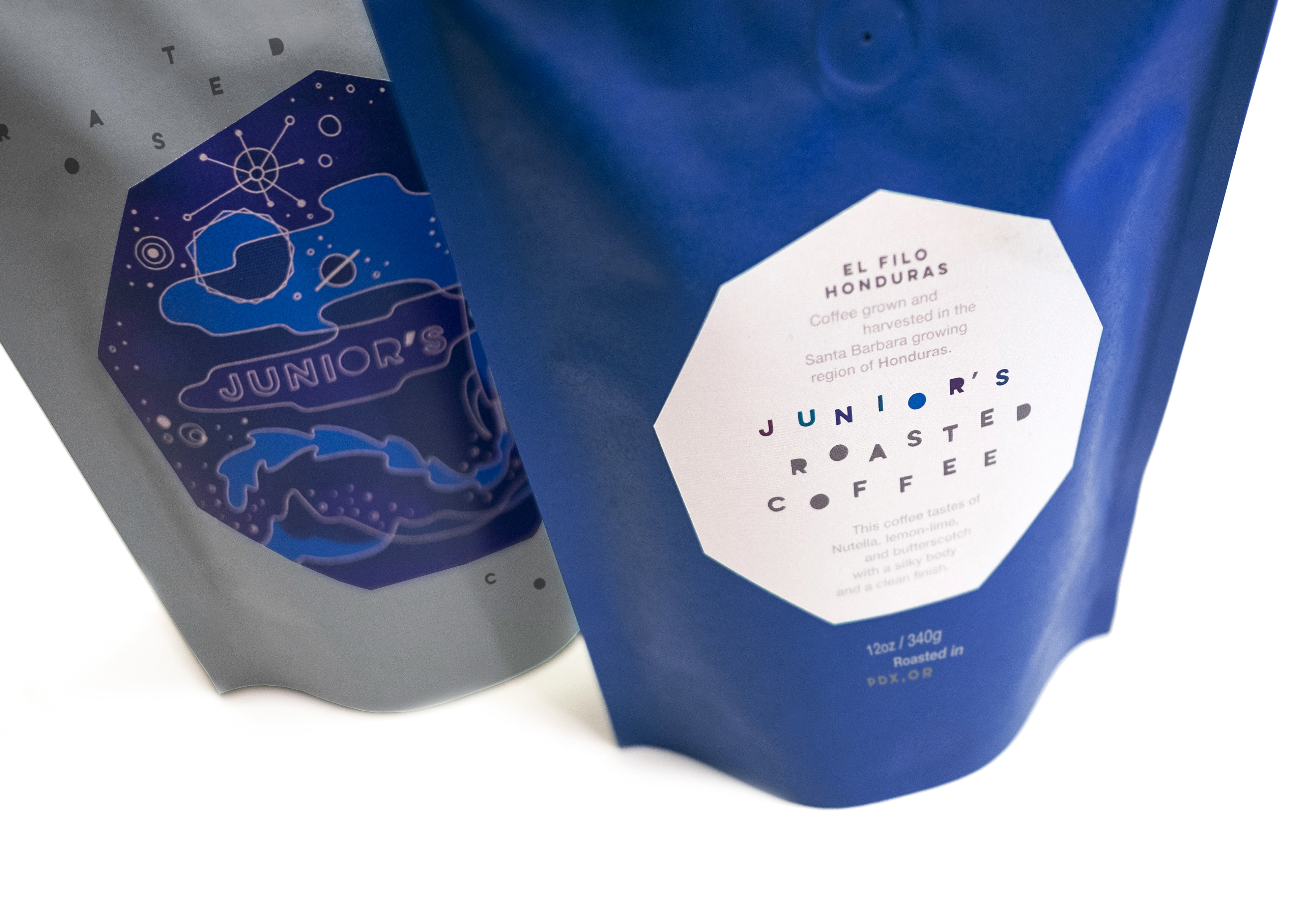
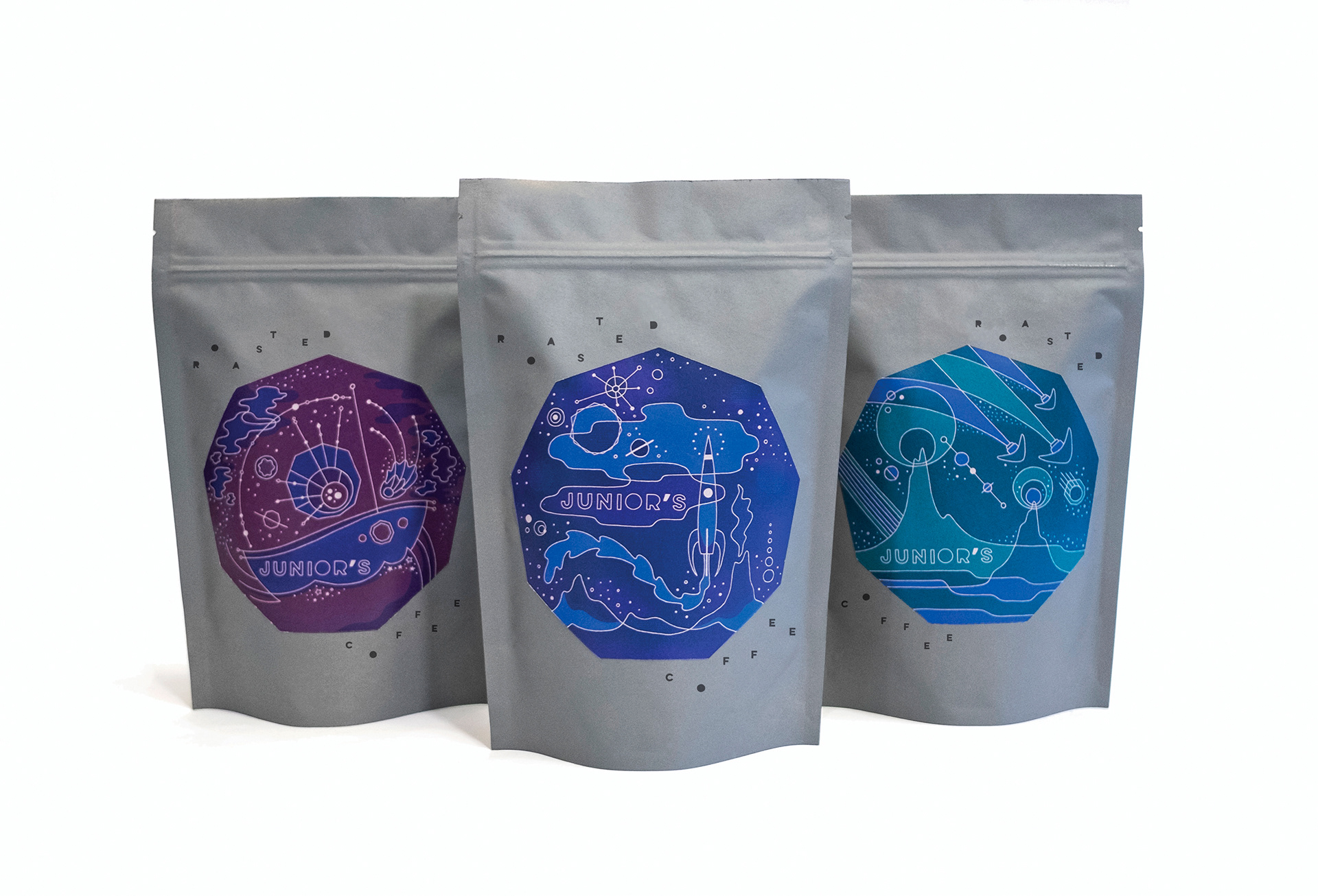
Once the logo and styles were determined, I treated the package design as a place to show what Junior might be dreaming about from her blanket fort, staring up into the night sky through the bedroom window. She’s imagining a future world and all the ways she will impact it. Junior is a modern day version of the young children of the Mid-Century who watched The Space Race and moon landing.